.bento-box-wrapper {
  border-radius: 1rem;
  overflow: hidden;
}

.bento__headline {
/**
Other styles
**/
  overflow: hidden;
}

.bento__text {
/**
Other styles
**/
  overflow: hidden;
}
From here I figured I could use keyframe animations with transform: translateY to move our elements into view.
I created separate classes to handle our animations, its important not to add too much functionality to one class. This also helps us out later as well, which you’ll see.
.reveal {
animation: 1.5s 1 normal cubic-bezier(0.65, 0.05, 0.36, 1) reveal;
}
.reveal-wrapper {
transform: translateY(100%);
animation: 1s 1 normal cubic-bezier(0.65, 0.05, 0.36, 1) 0.5s reveal
forwards;
display: block;
}
@keyframes reveal {
from {
transform: translateY(100%);
}
to {
transform: translateY(0%);
}
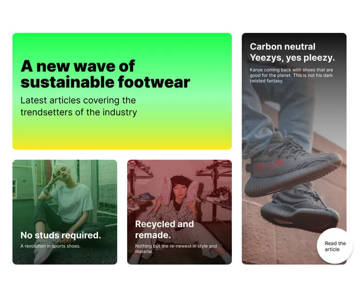
}This give us this.
See the Pen Untitled by Paul Truong (@Paul-Truong-the-scripter) on CodePen.
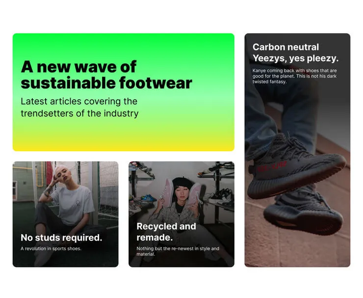
With the basic animation in place, I refactor the code to make the other boxes do the same.
See the Pen Untitled by Paul Truong (@Paul-Truong-the-scripter) on CodePen.
Wheres the JavaScript?
There isn’t any yet because it turns out I didn’t need JavaScript to get the animation running. There is a problem though.
The animation, as it is, will run on page load. We don’t want this since it’s very likely this component will be lower down on the page. Having the animation running on page load means the user might not even see it and get the warm and fuzzy feeling we want them to feel.
What we want to do is to have the animation run when the component comes into view. And for that, we need JavaScript
Enter: Intersection observer
Whenever I see a requirement for something to trigger when it comes into view, my first thought is to use intersection observer. And because I have the animation in a separate class, I’m thinking I can use intersection observer to add the animation class when the component is into view, triggering the animation.
So let’s do it.
As a first step I need to hide the boxes by default. We need to hide the boxes before we can reveal them. I do this by creating a new class to hide everything. My plan is to use an Intersection Observer to add the .reveal class which will overwrite the styles in the reveal_hidden class and trigger the animation.
.reveal_hidden {
  transform: translateY(100%);
  .reveal-wrapper {
    transform: translateY(100%);
  }
}
I also add a big placeholder element before the bento component so we can scroll and test the Intersection Observer.
Now we can start the JavaScript. I create an Intersection Observer which will observe the bento component. The reveal class will get added to each individual bento box when the bento component is scrolled into view.
const animateReveal = (entries, observer) => {
  entries.forEach((entry) => {
    if (entry.isIntersecting) {
      const bento = entry.target;
      const boxes = bento.querySelectorAll(".js-bento__box");

      boxes.forEach((box) => {
        box.classList.add("reveal");
      });
    }
  });
};

let options = {
  rootMargin: "0px",
  threshold: 0.8
};

let observer = new IntersectionObserver(animateReveal, options);

const target = document.querySelector(".js-bento");

observer.observe(target);
The code above was what I got to as a first pass. With a little refactoring we can code it like this.
const observer = new IntersectionObserver(
  (entries, observer) => {
    entries.forEach((entry) => {
      if (entry.isIntersecting) {
        const bento = entry.target;
        const boxes = bento.querySelectorAll(".js-bento__box");

        boxes.forEach((box) => {
          box.classList.add("reveal");
        });
      }
    });
  },
  {
    rootMargin: "0px",
    threshold: 0.8
  }
);

const target = document.querySelector(".js-bento");
observer.observe(target);
Making it work without JS and respecting users motion settings.
The bento component is almost done. There is just one more thing to do which is to make sure this code works for all users.
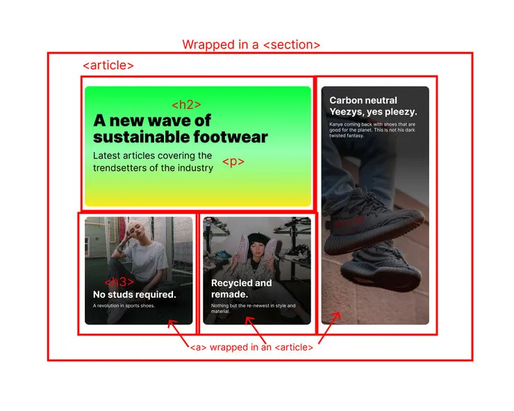
The markup is already semantic and accessible but we need to make sure it works without JS and to also respect the users motion settings.
Right now it’s hidden by default, so if JS fails to load then the animation will never run, meaning our articles will never show.
I decided to fix this by using JS to add the class reveal_hidden in the first place and remove it all from the HTML. If there’s no JS then the class isn’t added.
const bento = document.querySelector(".js-bento");
const boxes = bento.querySelectorAll(".js-bento__box");

boxes.forEach((box) => {
  box.classList.add("reveal_hidden");
});
That solves our problem with no JS. Now to respect the user settings. Some people don’t like all the animations, it can make them nauseous. Because we are good web developers, we need to respect that.
Once again, because we separated the animation, we can use the prefers-reduced-motion media query to stop the animations running. Here’s what it looks like.
@media (prefers-reduced-motion) {
  .reveal_hidden {
    transform: none;
    .reveal-wrapper {
      transform: none;
    }
  }

  .reveal {
    animation: none;

    .reveal-wrapper {
      animation: none;
    }
  }
}
We wrap the animation classes in the prefers-reduced-motion media query and remove all animations if the system has that set.
That’s a wrap
We’re done. At this point I will go through a polish up the code and make sure its in a good state. Once it’s polished up and I’m happy, I ship it. Here is what the finished product looks like. And here the Codepen with the full cleaned up code.